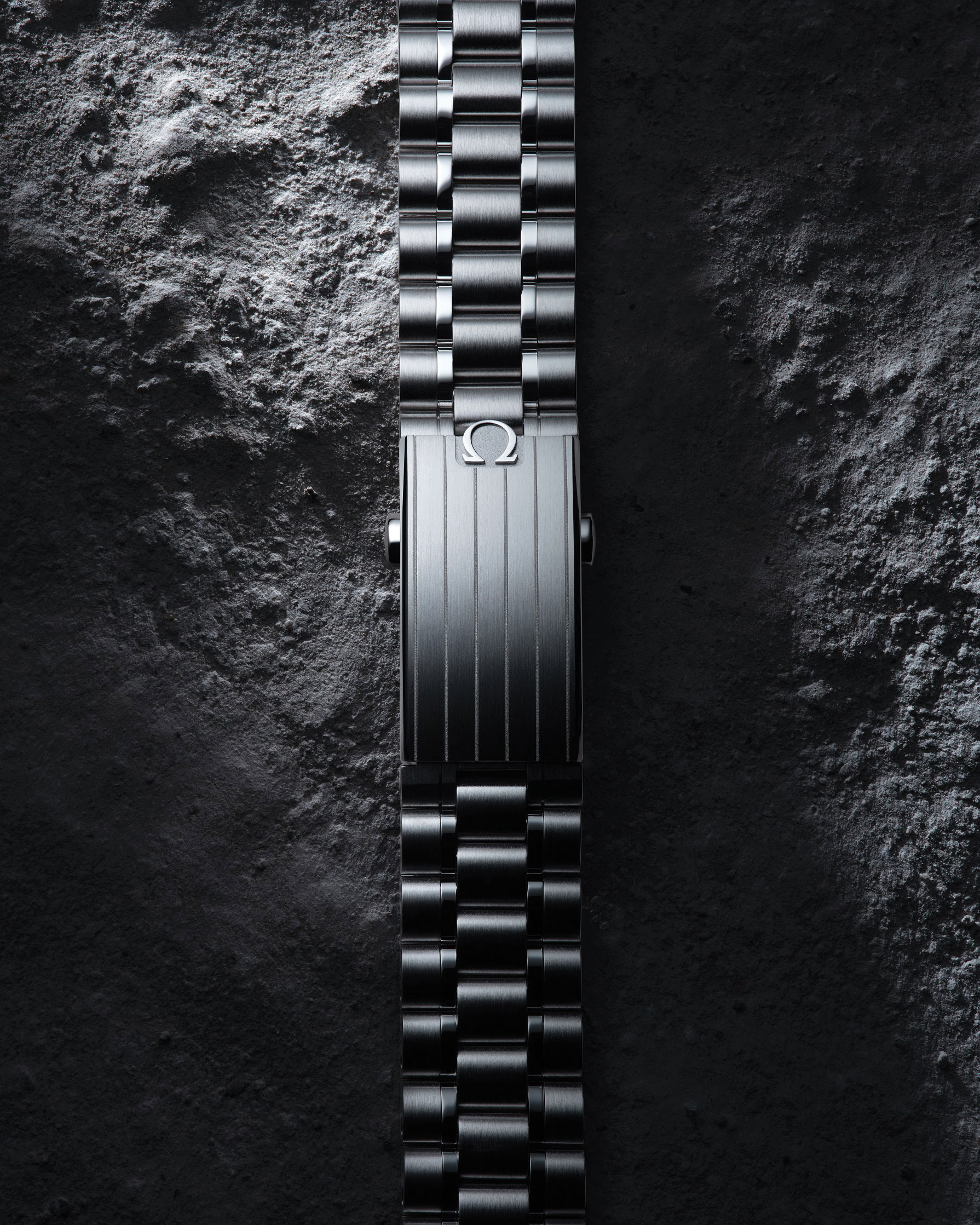
John Mayer’s Watch for Audemars Piguet Is “Like Looking Up at a Moonless Sky”

Singer and watch collector John Mayer teamed up with Audemars Piguet to design the very last Royal Oak Perpetual Calendar.

Article by T Australia

The Stellar Royal Oak Perpetual Calendar in collaboration with John Mayer.

Music artist John Mayer is known for many things. Famous romances that inspire songs? Tick. Being ridiculously good looking? Tick. But the “Your body is a wonderland” and “Daughters” singer is also a watch collector.

He recently teamed up with Swiss watchmaker Audemars Piguet to design the very last Royal Oak Perpetual Calendar or quantième perpétuel (QP for short). 

A long-lasting friend of the brand, Mayer lent his collector’s eye, taste for precision and aesthetic beauty to the design, working hand in hand with the AP teams. The distinctive timepiece, limited to 200 pieces, is equipped with the manufacture’s self winding Calibre 5134 and has been created in 18-carat white gold, enhanced by a deep blue dial evocative of the sky.

“My favourite watches have dials that you can stare endlessly at,” he said. “A great watch dial feels like a picture window – you look into it, not at it. In the case of this QP, it’s like looking up at a moonless sky. There is a true sense of nature in it.” 

The "Daughters" singer is an avid watch collector. Photo courtesy of Audemars Piguet.

The Grammy Award-winning artist went on to say: “And when you couple that sense of depth and vastness with the complication of a perpetual calendar, it is a very powerful combination of technical prowess and aesthetic design.”

To enhance the watch’s legibility and aesthetic harmony, Mayer has brought subtle modifications to the perpetual calendar display that only become apparent on closer inspection. While the number “31” of the date subdial is usually red on modern Royal Oak Perpetual Calendar models, here it is printed in white.

And for the first time, the “Swiss Made” inscription is printed in white at the bottom of the moon phase subdial rather than on the dial’s outer edge at 6 o’clock. 

Said Mayer: “The perpetual calendar is for me the ultimate complication, the benchmark for high horology, and though there are complications that are more complex, the historical footing of the QP in the history of watchmaking is what makes it stand out.”

Kennedy Brings The Patek Philippe Party to Melbourne

From December 1 – 3, Kennedy are hosting “Patek Philippe Passion For Workmanship” – an exhibition at The Ritz Carlton in Melbourne.

Article by Luke Benedictus

Patek Philippe x Kennedy Gala Dinner - State of PlayPhotograph courtesy of Patek Phillipe.

To try and grasp what a big deal Patek Philippe is in the watch world, consider the following. In a list of the most expensive watches ever to be sold at auction, Patek Philippe occupies nine out of the top 10 spots.  The only interloper to prevent a total monopoly is Paul Newman’s Rolex Daytona that comes third on the list – but its $US17.75 million price-tag stemmed more from its celebrity provenance than its horological pedigree.

How Patek came to occupy such a hallowed position in the industry stems, in part, from their technical mastery. During its 180-year history, the brand was responsible for inventing the perpetual calendar, which automatically adjusts to allow for leap years as well as the different number of days in a month. In addition, Patek was also responsible for introducing the minute repeater and double chronograph in a tradition of innovation that’s been crowned by over 100 patents.

"Patek Phillipe A Passion for Workmanship".
"Patek Phillipe A Passion for Workmanship". Photograph courtesy of Patek Phillipe.

In addition, Patek has a peerless reputation for their painstaking attention to detail. Every component of their watches from the dials to the movements are hand-crafted in-house before being subjected to a meticulous level of finishing. The stringency of these standards prompted the brand to set up their criteria for quality control. Established in 2009. the Patek Philippe Seal guarantees the upkeep and maintenance of any of their watches for their entire lifetime, regardless of the date when they were produced.

“Patek Philippe is a brand that really speaks to watch enthusiasts,” explains Debbie Kok, General Manager of Kennedy, the multi-brand retailer that’s sold Patek since the 1980s. “Patek’s history, art and craftmanship really resonate with our market.”

Patek Philippe x Kennedy Gala Dinner - State of Play - 30th November16
Patek Philippe and Kennedy Gala Dinner. Photograph courtesy of Patek Phillipe.
Patek Philippe x Kennedy Gala Dinner - State of Play - 30th November11
Patek Philippe and Kennedy Gala Dinner. Photograph courtesy of Patek Phillipe.

Keen to share this tradition, Kennedy are hosting the Patek Philippe Passion For Workmanship exhibition at The Ritz Carlton in Melbourne. Unveiled at a gala dinner this week, the exhibition was essentially a chance for the public to see Patek’s 2023 Novelties and main collection that included a range of pieces from Calatrava, Aquanaut, Golden Ellipse and Nautilus families among others.

Among the 100 timepieces on display, highlights included two new ladies’ Nautilus references decked out with dials in blazing magenta. The richness and shimmer of this eye-catching colour emanate from the dial base being coated with more than 50 layers of translucent lacquer before being embellished with the Nautilus’ trademark wave pattern. First seen, earlier this year in the new Calatrava, the extension of the colour to other collections suggest Patek’s purple patch is set to continue.

Patek Philippe x Kennedy Exhibition Space- State Of Play - 1st December _GRIFFIN SIMM_Finals_7
"Patek Phillipe A Passion for Workmanship". Photograph courtesy of Patek Phillipe.

“They’re increasing the usage of that really prominent magenta / purple colour, and this is the first time it’s been extended to the Nautilus,” Kok explains.

“Patek Philippe A Passion for Workmanship” is exhibiting at Level 2, The Ritz Carlton, from Friday December 1 – Sunday December 3. 10am – 4pm. Book tickets here.

Van Cleef & Arpels Adds Stealth to the Mechanics of Timekeeping

Our resident watch expert Luke Benedictus steps behind the scenes for the jewellery house’s whimsical Secret Watch collection.

Article by Luke Benedictus

It’s like stepping into a fairytale. Ostensibly, I’m entering the Van Cleef & Arpels booth at Watches and Wonders, the Geneva trade fair and media event for Switzerland’s most well-known industry. Except this space is different to anything I have encountered elsewhere.

For starters, it’s designed to evoke the feel of an enchanted forest at twilight. Sprawling vines of oversized glass beads in green and blue hang from the ceiling and the walls comprise dark lacquered panels etched with mystical gold-leaf images of flora and fauna. Van Cleef & Arpels, it’s fair to say, is not like other watch brands. “One of our sources of inspiration that has been there from the very first years is of a benevolent form of nature that’s a bit dreamlike, with a touch of imagination and poetry,” explains Nicolas Bos, the chief executive and creative director.

Founded in Paris in 1906, Van Cleef & Arpels soon developed a reputation as a luxury jewellery house, and its highly decorative aesthetic informed its expansion into watches in 1916. Consequently, it doesn’t make watches as such, but rather, as the brand puts it, “jewels that tell the time”. A notable expression of this sentiment were the “secret watches” that concealed their timekeeping ability behind bejewelled facades. Part of the reason for this obscuration was that it was considered ill-mannered for a lady to look at her watch in the middle of a glamorous soiree. A secret watch was disguised as a bracelet, necklace or pendant that would discreetly reveal the time to the wearer’s eyes alone.

While social mores brought about the first secret watches, the technical challenge of concealing a watch mechanism within a piece of jewellery soon became another incentive, offering a craftsperson the chance to demonstrate their ingenuity and skill. “Maybe I shouldn’t say this at a watch fair,” Bos admits, “but I think that some designers thought that a watch dial wasn’t as nice to look at as the jewellery-work and that it would disrupt the integrity of the bracelet or the brooch. So they thought: ‘Let’s hide it.’ ”

The undercover tradition continues at Van Cleef & Arpels this year with the Ludo Secret Watch. At face value, it’s a belt-like bracelet made of rose gold and bedecked with 185 pink sapphires. So far, so spectacular. Press the two sides of the buckle together and a mother-of-pearl watch dial peeks out. Further clandestine horology is revealed in the brand’s Perlée Secret Pendant range. The six pieces in this collection are each worn on a long necklace and hide their dials beneath rotating covers emblazoned with coloured gems or extravagant cabochons. Behind all this glitz, there’s perhaps a deeper message here consistent with Van Cleef’s romantic vision. A secret watch takes the relatively humdrum business of timekeeping and subordinates its importance to the celebration of beauty.

“Don’t worry about being late for that appointment,” it whispers. “Stop and marvel at the sunset instead.” “Don’t be a slave to time,” it insists. “Remember you’re the person in charge.” It’s a magical idea with a seductive allure. Albeit one that might not stand up to scrutiny outside the realms of a fantasy kingdom.

Cartier’s New Tank Proves the Power of Playing it Straight

When it comes to watches, Cartier’s true speciality is its mastery of shapes.

Article by Luke Benedictus

Cartier Tank_1Cartier Privé Tank Normale watch, $55,000, cartier.com.au. Image courtesy of Cartier.

Refusing to confine itself to circular cases, the French maison has always displayed an open-minded approach to geometry, making timepieces in forms ranging from parallelograms to bells. One reason for this, explains Pierre Rainero, Cartier’s director of image, style and heritage, is that Louis Cartier, the founder’s grandson who brought the brand international acclaim, never trained to be a watch designer. Rather than produce technical drawings, he would present his design studio with visions and guidelines for daring new concepts. “The original idea since the first watch — the Santos — was to have the purest shape possible,” says Rainero.

This penchant for clean lines and bold shapes is showcased at the Cartier Culture of Design Pop Up, which runs until June at 74 Castlereagh Street, the brand’s former Sydney flagship. The exhibition concentrates on the evolution of four watches (Santos de Cartier, Panthère, Ballon Bleu and Tank) and three of the maison’s most celebrated jewellery lines (Trinity, with its interlacing bands; Love, defined by that iconic screw motif; and Juste un Clou, which transformed a humble nail into a luxury item).   

Of these, top billing goes to Cartier’s most recognisable timepiece: the Tank. Released in 1919, it was purportedly inspired by France’s stocky tank the Renault FT, with the watch said to evoke a bird’s-eye view (the case and dial resemble the body and cockpit, while the elongated brancards at the sides reflect tracks). The original has been adapted into manifold forms — the case has been slimmed down and lengthened (Tank Américaine), made lopsided (Tank Asymétrique), placed on a metal bracelet (Tank Française) and powered by the sun (Tank Must SolarBeat) — and yet, with its distinctive design, the Tank has never lost its identity.

In part, that’s due to the dial, with its angular Roman numerals and railway-track minute counter, all of which could feel a little austere were it not for the addition of that slightly eccentric bejewelled crown. The ornate protrusion not only serves as a reminder of Cartier’s jewellery heritage, it also works as a visual counterpoint to the formality of the dial — like a colourful pocket square with a navy suit. “The cabochon was already present on the Santos,” says Rainero. “It’s a detail that’s printed in our culture.”

In March, at Switzerland’s Watches and Wonders Geneva trade fair, enthusiasts finally got the Tank revival they’ve been waiting for: the Tank Normale. Part of the Cartier Privé limited-edition collection, the Normale marks the comeback of the very first Tank, restoring the stark proportions and bevelled sapphire crystal of the original. It comes in a yellow-gold or platinum case and a choice of strap: either leather or a bracelet made with the same precious metal as the case. 

Whatever the variant, the charm of the Normale lies in its pared-back design. On the wrist, it feels like a love letter to right angles, the sharp brancards and stubby case accentuating the squareness of the dial. It is, once again, a display of Cartier’s proficiency with proportions and ability to coax familiar shapes into bold new forms.

This is an extract from an article that appears in print in our twelfth edition, Page 32 of T Australia with the headline: “In Good Shape”

The Common Bond of Watchmakers and Architects

Despite wild disparities in the scale of their work, watchmakers and architects share a common bond.

Article by Luke Benedictus

Solomon R. Guggenheim MuseumThe Solomon R. Guggenheim Museum. Alex Eckermann.

It’s impossible to sit down opposite Pierre Rainero without feeling a little oafish and bedraggled in comparison. Perched on a sofa at the Watches & Wonders fair in Geneva, the Cartier director of image, style and heritage is dressed with understated panache in a navy suit and plum-coloured tie, a whisper of pocket square peeking out of his jacket. With his neat, greying hair and glasses, Rainero is a model of quiet poise and exacting judgement, a man who seems as if he was predestined for his role as the gatekeeper of style for the venerable French maison. Consequently, it’s a touch surprising to hear him reveal that an alternative career once beckoned. “I’m a frustrated architect,” he confesses with a smile.

Had he taken up his protractor and ruler, Rainero would, in fact, have been the sixth generation of his family to become an architect. But his father discouraged him from the trade, warning him of the financial insecurities and so, instead, he began working for Cartier in 1984. Rainero tells me that architecture and horology actually share many similarities. Both practices, he explains, are artistic ones that are preoccupied with how their products — whether it’s a diving watch or a multistorey office block — interact with the human form. “A sculpture or a painting is something you may appreciate but you only look at it as a piece that’s external,” Rainero says. “But you live in architecture, so it’s not only about the aesthetics but that strong human dimension of how it fits into your life. A piece of jewellery or a watch also shares that human dimension because it’s something you wear.”

Architecture and watchmaking are both multilayered disciplines that involve a complex fusion of art, design and engineering. While there is plenty of scope for creative noodling, it must always be anchored by sufficient technical rigour. Both are ostensibly functional pursuits — a watchmaker makes an object to tell the time, while an architect creates a structure for habitation or to house some other activity — yet both practices regularly transcend their utilitarian purpose, becoming expressive mediums for personal style and status.

Consequently, it’s not surprising that a number of high-profile architects, from Frank Gehry to Zaha Hadid, have experimented with watch design. Along the way, these efforts have resulted in some notable timepieces. The Swiss architect and Bauhaus disciple Max Bill was well acquainted with horology due to his grandfather’s profession as a watchmaker and would go on to design watches for brands including Omega and Movado. But his most celebrated work in this field is his collaboration with the German manufacturer Junghans. In 1956, Bill designed a kitchen clock with a timer, an inverted egg-shaped creation made of light blue ceramic that became sufficiently revered that it now hangs at New York’s MoMA. The clock’s spare dial offered a preview of his finest wristwatches. Released in 1961, the Junghans Max Bill timepiece remains instantly recognisable with its squared lugs, spindly hands and printed line hour markers. The watch is a wrist-bound testimony to Bill’s philosophy of distilled functionalism, in which every detail must earn its place.

A 2017 timepiece by Mido, inspired by the Solomon R Guggenheim Museum in New York; the museum, designed by Frank Lloyd Wright. Photography courtesy Mido.

The French architect-designer Marc Berthier also picked up his loupe to create a memorable watch in 2010. The Hermès Carré H was a singular-looking square timepiece whose lightly softened edges added visual balance and made it a particularly comfortable watch to wear. Today, rounded corners appear on everything from smartphones to laptops and have become so absorbed into our modern design language that they almost seem like industry standard. But at the time of Berthier’s first Carré H release, they felt sharply contemporary and were quite literally ahead of the curve.

The creative stimulus of bricks and mortar continues to inform watchmaking in other ways, too. “What is good architecture? It’s innovation, functionality and aesthetics,” says Franz Linder, the CEO of the Swiss watch brand Mido. “And when we design watches, those are exactly the ambitions we have, so we wanted to reflect these shared values.” Linder is explaining the rationale behind Mido’s tagline “Inspired by Architecture”, which the brand first used in 2002 when it began translating the design cues of iconic buildings onto the wrist. The first watch in this series riffed on the Colosseum in Rome. Echoing the building’s features, the dial had a multi-level structure, a sandblasted texture to evoke antiquity and an inner flange around the indices to reflect a bird’s-eye of the amphitheatre’s stands. Since then, there have been other watches in this vein, paying horological tribute to landmarks ranging from London’s Big Ben to Singapore’s ArtScience Museum.

In the wrong hands, these timepieces could feel like some tacky form of holiday souvenir, but Mido avoids this by virtue of the restraint of its executions. The Mido x Guggenheim, for example, merely incorporates gentle undulations around the indices to conjure the sinuous curves of the Solomon R Guggenheim Museum. After all, as Linder points out, “No-one wants to wear a building on your wrist.”

Some 20 years since it was dreamed up, the “Inspired by Architecture” slogan is now used more laterally in the brand’s marketing activities. To communicate the tough functionality of its Multifort range, for example, Mido teamed up with the Brisbane-based parkour athlete Brodie Pawson, whose acrobatic flair and general disdain for the law of gravity have earned him a large social media following. “Parkour is a very urban sport in which you use the architecture of a city to practise,” says Linder. “It’s spectacular but it’s dangerous, so you need good performance and precision, which are always key elements for our watches.”

When watchmakers turn to great architecture for inspiration, perhaps the quality they most yearn to emulate is the staying power of a great building. Such longevity is now more important than ever, given the explosion in demand for secondhand watches. The pre-owned market has become the industry’s fastest-growing segment and, according to a report by McKinsey and the Business of Fashion, it’s set to account for up to $45 billion of watch sales by 2025. “People today may wear Mido watches that are 50 years old,” says Linder. “But if we talk about Roman architecture, you have fantastic buildings that are hundreds of years old.” The ambition to make watches that can endure in this way reveals the irony at the heart of modern watchmaking. Despite the basic purpose of a wristwatch, the ideal design is one that is ultimately timeless.

This is an extract from an article that appears in print in our seventh edition, Page 34 of T Australia with the headline: “Time + Place”

The Future of Watch Expos, Big and Small

As budgets blow out and tensions rise, watch expos are evolving from their tried-and-tested template.

Article by Luke Benedictus

Pre-pandemic Baselworld, the annual watch and jewellery fair that began in 1917. Photography courtesy Baselworld.Pre-pandemic Baselworld, the annual watch and jewellery fair that began in 1917. Photography courtesy Baselworld.

For more than a century, Baselworld ran like clockwork. The annual watch and jewellery fair began in 1917 under the name Schweizer Mustermesse Basel and continued through world wars and all manner of social upheavals. In recent times, the Swiss city on the banks of the Rhine has been invaded every year by scores of brand reps, buyers, journalists and up to 100,000 members of the public. Packs of media thronged Basel to report on the unveiling of new timepieces and to get an overview of the direction the watch industry as a whole was heading in.

For brands, meanwhile, Baselworld presented a unique business and PR opportunity: a chance to meet retailers and press from all over the world at a single event. In short, if you were a watch company with global aspirations then attendance was almost compulsory — in 2008, some 2,087 exhibitors showed their wares. But over the past decade, Baselworld gradually lost its lustre. Today, having not run for two years, the world’s biggest and oldest watch fair looks to have finally run out of time.

The beginning of the end came in July 2018, when the Swatch Group — the world’s largest watch company and home to brands including Omega, Blancpain, Longines and more — announced it was pulling out of Baselworld. The next year, Breitling, Seiko and Grand Seiko followed suit. There’s no doubt these high-profile departures were extremely damaging. Yet it’s possible the watch fair may have survived them had it not been for the way it handled a certain global pandemic.

Baselworld 2020 had to be cancelled due to Covid-19. According to reports, organisers proceeded to inform exhibitors that they were not contractually entitled to a full refund. It’s said that Baselworld offered to carry over 85 per cent of reservation costs to cover fees for the following year’s fair, with the remaining 15 per cent to be retained by the organisers and put towards out-of-pocket costs from the 2020 cancellation. For many brands already starting to question their involvement, this was fighting talk.

It’s said that Hubert J du Plessix, the director of investments and logistics at Rolex, who is also the president of the Baselworld exhibitors committee, wrote a letter to organisers pleading for better terms for everyone. He warned that if brands were not refunded, they would not participate in future events, which could spell the end of Baselworld. These proved to be prophetic words. With refunds still not forthcoming, Baselworld received a hammer blow as two of the watch world’s most powerful brands — Rolex and Patek Philippe — pulled out, as did Chopard, Chanel and Tudor. The death knell came shortly afterwards as LVMH’s watch stable did the same.

The refund wrangle was apparently the last straw for many brands, particularly the smaller exhibitors who relied on the trade show to fill their annual orders and who might have lacked the cash reserves to absorb such a hefty investment loss. But even for companies that are cashed-up, Baselworld was a major financial drain. The Swatch Group, for example, was reportedly spending about $67 million to participate each year due to a mountain of costs including booth space hire, lodging, flying in staff and client entertainment.

The painful outlay wasn’t limited to exhibitors. During the fair, visitors were forced to stomach outrageous price hikes as local restaurants and hotels exploited the captive audience. Attending the watch fair as a journalist between 2012 and 2019, I once ordered a starter at a restaurant — a handful of asparagus spears with hollandaise sauce — that cost the equivalent of $70. Even Baselworld’s managing director, Michel Loris-Melikoff, conceded the city had become inhospitable in a 2019 interview with The New York Times. “Hotels added margins of 300 to 500 per cent during Baselworld,” he said. “This is not sane.”

On top of these monstrous costs, brands were also beginning to question Baselworld’s relevance. Digital channels are increasingly being used for wholesale orders and disseminating press information, while social media has become a proven way to reach consumers. Covid merely accelerated the acceptance of all things digital. In that context, Baselworld’s head-spinning price of entry was more unpalatable than ever.

Meanwhile, brands had also begun to consider strategic alternatives. After all, if you release a new collection at the same time as hundreds of other brands, it’s easy for your work to get lost in the noise. Companies started to monopolise the spotlight with individual showcases. The Swatch Group experimented with its own Time to Move event, while Breitling and Grand Seiko launched individual summits. This year saw the third LVMH Watch Week, which featured the conglomerate’s key watch brands: TAG Heuer, Hublot, Bulgari and Zenith.

Sadly, LVMH’s plans to hold a real-world event in Geneva was ultimately foiled by the advent of Omicron. But despite being forced into a digital- only format, LVMH Watch Week featured a host of interesting timepieces that — given the lack of competitors — secured the time and space to shine. These more tightly curated events clearly have their value. And yet anyone who has experienced the heady madness of Baselworld might also wonder if, for all its excess, something has been lost with its demise. It was an attention-grabbing extravaganza — a concerted show of strength and a focal point for the watch industry at large.

However, it seems that smaller brand showcases and larger fairs may not be mutually exclusive. The brands from LVMH Watch Week will also exhibit at Watches & Wonders, a fair that now includes most of the big brands — Rolex, Patek et al — with the conspicuous exception of the Swatch Group. Whether the major trade shows and more bespoke events will continue to coexist long-term remains to be seen. But hopefully no-one will have to pay $70 for a plate of asparagus ever again.

This is an extract from an article that appears in print in our fifth edition, Page 30 of T Australia with the headline:
“Fair Trade”
Order a copy | Subscribe